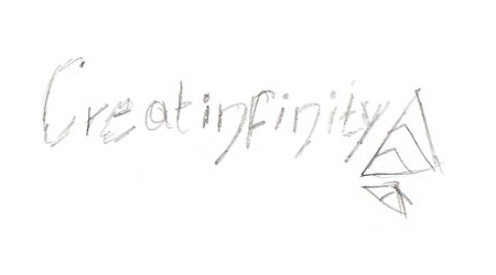
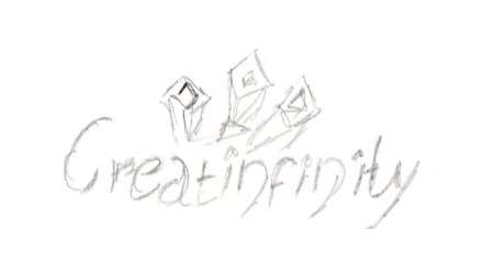
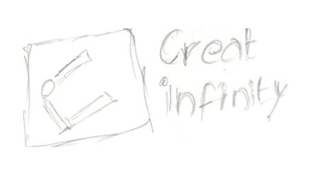
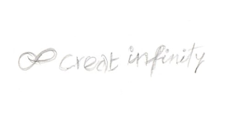
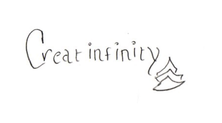
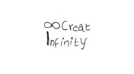
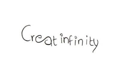
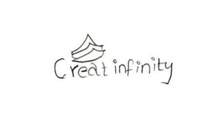
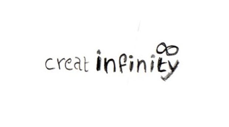
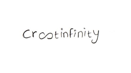
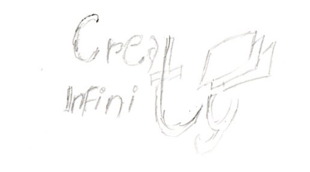
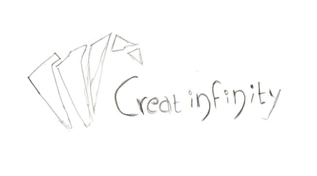
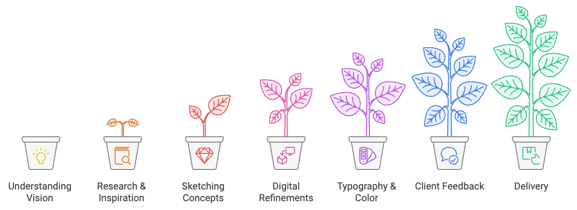
Overview
Branding Process

1. Understanding Vision
.png?updatedAt=1731176977828)
2. Research & Inspiration
3. Sketching Initial Concepts
4. Digital Explorations & Refinement
After refining the best sketches, I transitioned to digital design. I tested multiple iterations in Figma, focusing on creating a smooth and flowing logo that balanced simplicity with visual interest. I experimented with different combinations of symbols, typography, and colors, ensuring that the design would appeal to users looking for a fun, approachable, and empowering tool. Special attention was given to scalability, ensuring the logo worked well on both digital and physical mediums.


5. Typography & Color Selection


Typography Used in this Logo
Atma
Regular 400
The quick brown fox jumps over the lazy dog
Medium 500
The quick brown fox jumps over the lazy dog
Semi Bold 600
The quick brown fox jumps over the lazy dog
Bold 700
The quick brown fox jumps over the lazy dog
Extra Bold 800
The quick brown fox jumps over the lazy dog
Black 900
The quick brown fox jumps over the lazy dog
Colors used for this project


6. Client Presentation & Feedback
I presented the refined logo concepts to stakeholders, each accompanied by a detailed explanation of the design rationale. Feedback highlighted the importance of ensuring the logo was dynamic yet clean, representing fun without overwhelming the viewer. I refined the design based on their input, simplifying some elements.
7. Finalization & Delivery
The final Creatinfinity logo featured a smooth, flowing and playful accents, paired with bold, vibrant colors that communicated creativity and joy. I delivered the final logo in various formats, suitable for both digital platforms and physical products. A set of brand guidelines was also provided to ensure consistency across all applications.